the start
In 2022, a group of college graduates with big dreams and ideas noticed how Alabama is sorely lacking in local, unbiased news media and wanted to do something about it. Print media is dying, and today the majority of readers receive their news from larger and for-profit news outlets that don't usually report on hard, local news or subjects like Alabama's state congress.
the sunrise news ventured out to fill a local news desert.

the logotype
The logo font is Poppins Bold. The round yet smart edges of the letters reflect the bright and hopeful perspective of the future of local journalism, but are stern enough to command integrity and respect that is required in hard news.
The rising sun rides into the logotype, signaling the rise of a new start. It's like having your morning cup o' joe with your morning Monday newsletter. The client wanted their readers to look forward to seeing the logo, and not experience the dread many news media logos inspire.
Accessibility is an important part of news. The simple, flat design in a sans serif font ensures that The Sunrise News is easily readable to everyone.


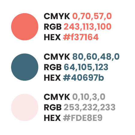
color palette
The color palette was picked for its warmth and usability across digital platforms. A suitable description between the primary color (1) and the secondary colors (2, 3) would be that they contrast "like the cold spring dew against a new sunrise".
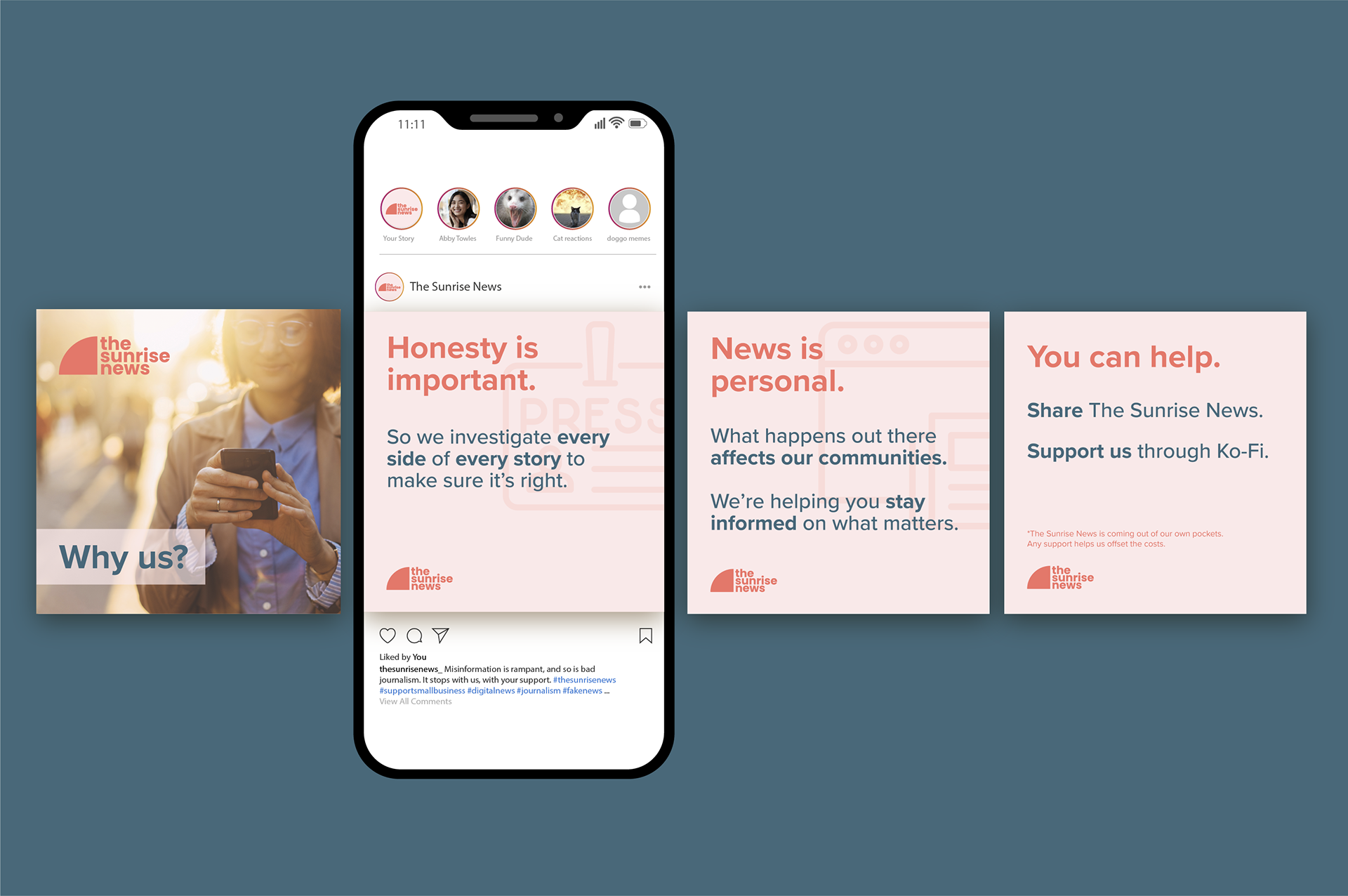
social media
As part of the branding package, I created assets and an initial marketing campaign to use across The Sunrise News' social media platforms.